
You are here
Lower Literacy Web Users
Posted by Lori Ayre on April 18, 2005
In his March 14, 2005 Alertbox article Lower-Literacy Users, Jakob Nielsen reports that the reading behaviors of lower-literacy users is different from higher-literacy users and offers up some suggestions for website designers.
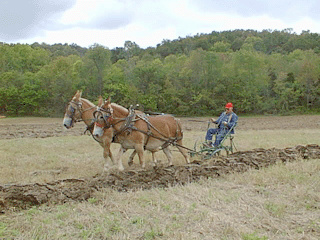
Unlike higher-literacy users, lower-literacy users cannot scan text. Instead, they must read word for word. Nielsen describes this process as ?plowing? the text. When plowing text, users are unlikely to notice elements of the page outside of the text because their field of view is so narrow.
They are also unable to scan navigational aids to select the one most appropriate for their need. Instead, they must consider each option one at a time, or to simply skip over numerous items when the options become overwhelming.
Lower-literacy users also tend to skip over text when it becomes too dense. Scrolling is also problematic because the ability to keep track of where one is on the page as it scrolls down requires scanning, which lower-literacy users cannot do.
Another problem is the search box. If the search box requires perfect spelling, it is unlikely that a lower-literacy user will have much success.
Nielsen provides suggestions for making a website more manageable for lower-literacy users including the following:
? Simplify the text.
? Prioritize information
? Avoid text that moves or changes
? Streamline the page design
? Simplify navigation
? Optimize search
Simplify the text: Nielsen recommends making the text on the home page to a 6th grade reading level. Other pages should not exceed an 8th grade reading level.
Prioritize information: To prioritize information means to put the most important information at the very top of the page. While this is consistent with usability guidelines for all users, it is important to utilize the first two lines because lower-literacy users are likely to give up after plowing through the first two lines of text. Nielsen recommends eliminating scrolling entirely (which will benefit both teenage users and lower-literacy users).
Avoid text that moves or changes:Animations and fly-out menus are particularly difficult for lower-literacy users and should be avoided. Nielsen points out that these features are also problematic for international users and users with motor skill impairments.
Streamline the page design: Nielsen recommends steering clear of multiple column layouts because a single main column will make it easier for the lower-literacy user to pick out design elements. He notes that this type of simplified design will also benefit the users viewing the site via a handheld device such as their phone or PDA.
Simplify navigation: The simplest form of navigation is when the main choices are placed linearly in a menu bar. Again, the goal is to avoid the need to scan the page looking for navigational elements.
Optimize search: Nielsen recommends adding features that make the search box more forgiving of people who might not be able to spell the item they are seeking or are more inclined to make typos. This includes seniors and lower-literacy users. Spell-check, stemming, truncation, and fuzzy searches are some of the ways a search box can be made more user friendly.
Nielsen argues that making web sites more usable for lower-literacy users will make them more usable for higher literacy users as well. He provides documentation to prove the accuracy of his hypothesis.
As institutions very much involved in promoting literacy, it is important that library websites address the needs of lower-literacy users.
Every library should evaluate their site to ensure that their website is free of characteristics that are particularly difficult for lower-literacy users including confusing layout, sophisticated or text-heavy pages, or required scrolling to get to the most important links. While implementing advanced search features is challenging, all the other suggestions are easy-to-implement and every library will should see about incorporating them immediately.